Recreating self-service reports within Irth’s embedded Power BI allows you to explore your data in a way that suits your unique needs. With just a few steps, you can quickly generate custom reports, track key metrics, and gain valuable insights—all without needing advanced technical skills. This guide will help you get started by walking through how to recreate your existing Self-Service Reports inside of Power BI.
To watch our video step-by-step overview, CLICK HERE!
1: Navigate to ANALYTICS > Power BI Reporting
Hint: Run the SSR report and snap it to one side of your screen using either **Windows logo key** [+ ]**Left or Right arrow** (Windows) or **Globe**[ + ]**Control**[ + ]**Left or Right arrow** (MacOS). Snap a browser window with Utilisphere and Power BI to the opposite side to view both side-by-side. Our example is below for reference:
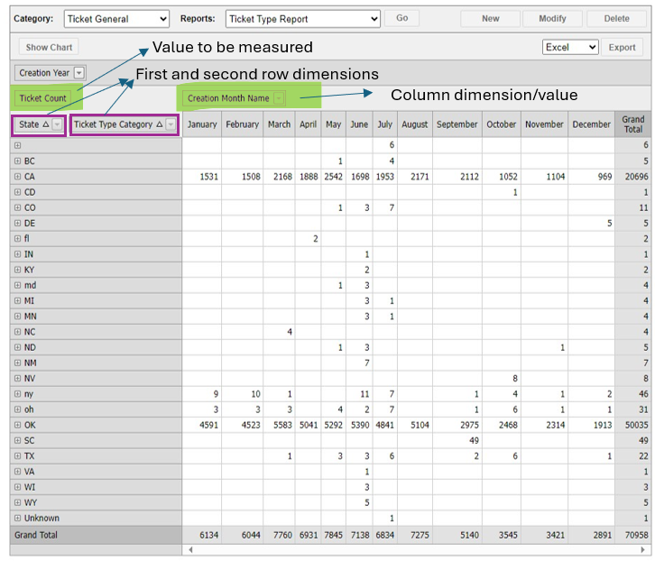
2: Click "CREATE NEW REPORT"

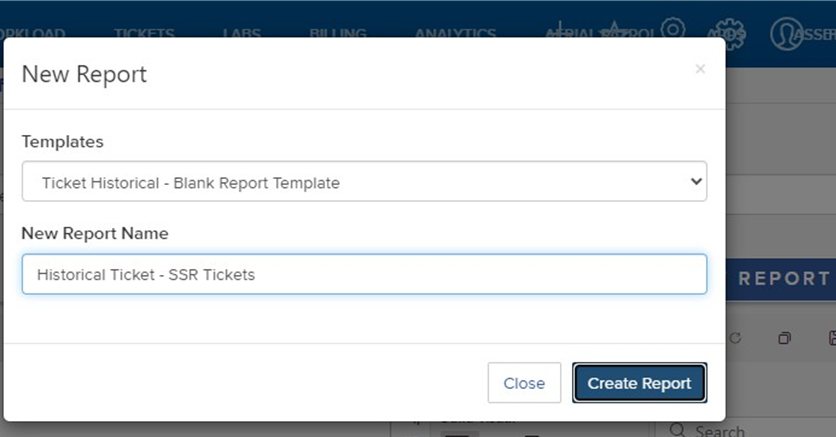
3: Select the "Ticket Historical - Blank Report Template" option

4: Click the "New Report Name" field

5: Key in a name for your report.
Hint: Always include either ‘Historical’ or ‘Live’ in the report name based upon the template used to create.
Hint: All SSR reports related to tickets can be built in one Power BI report with each SSR on its own tab/dashboard. This can streamline not only their creation, but future reporting reviews and insights.
6: Click "Create Report".

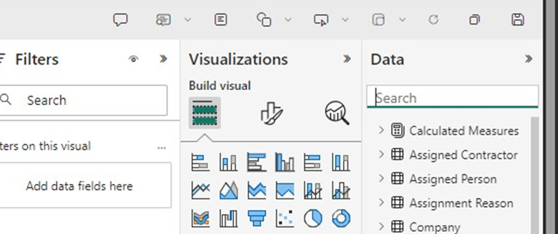
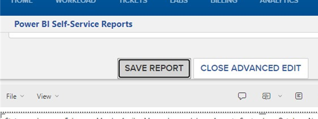
7: Click "CLOSE ADVANCED EDIT" or "OPEN ADVANCED UNTIL" until you can see the Data, Visualizations, and Filters side panels.
8: Click the Matrix icon

9: Click the "Search" field in the Data panel
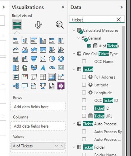
10: Search for the value being counted; in this example 'tickets'.
11: Drag the desired measure to the Values format box.
12: Type your first row value in the Data Search. In our example, this is 'State'
13: Drag the measure to the Rows format box

14: In the 'Data' side panel, type the name of any additional row dimensions. Our report sample uses 'Type Category'
15: Click and drag the subsequent dimensions to the Rows format box under the existing Row values.
16: On your existing Self-Service Report, click the plus sign (+) image to expand and view sub-rows.
17: Do the same within Power BI. This is just to double check that these reports are looking the same.

18: In the “Search” field, type the column value; for this example, it’s the month name, so we typed ‘month’.
19: Drag the dimensions to the columns format box.

20: Since Self-Service only contains the last 3 years, we need to add a filter to our Power BI dashboard to limit to: “2022”, “2023”, and “2024”.
21: To do this, click on the “Search” field and type ‘year’.
22: Click and drag the “Creation Year” dimension to the ‘Filters’ side menu.

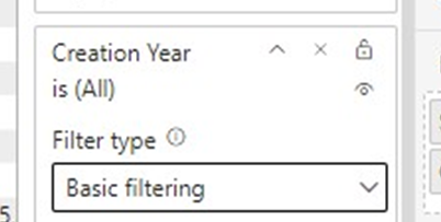
23: Switch Creation Year to "Basic filtering" using the dropdown.
24: Click "2022", "2023", "2024"
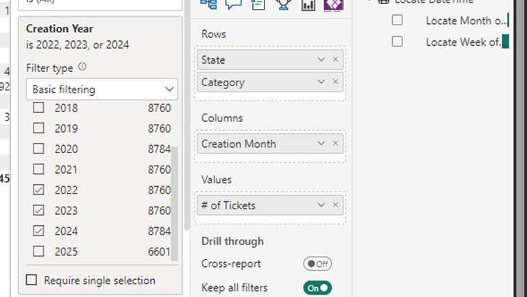
25: Collapse all side menus in Power BI for better visibility using the double right arrows. (>>)
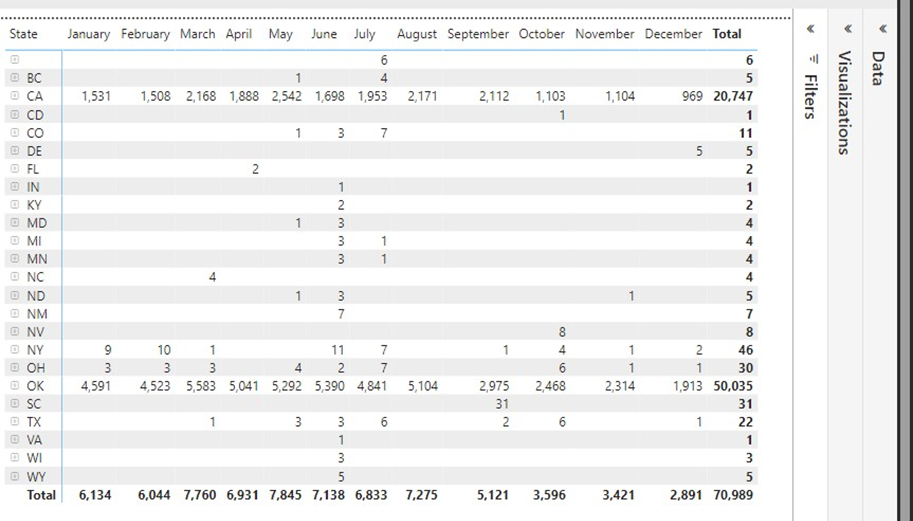
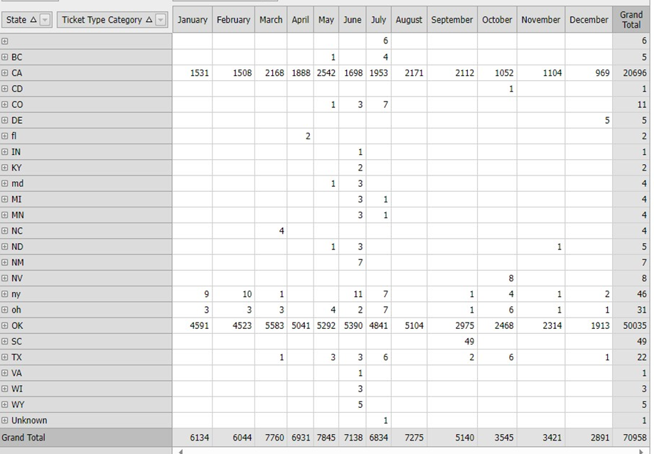
26. Validate all data matches between the two reports:
Power BI:
Self-Service Report:
27: Click "SAVE REPORT"
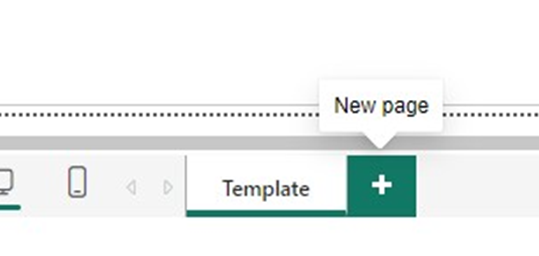
28: Click the "+" icon to create another related dashboard which correlates to another Self-Service Report.
29: Repeat steps 1-27 as needed.
Was this article helpful?
That’s Great!
Thank you for your feedback
Sorry! We couldn't be helpful
Thank you for your feedback
Feedback sent
We appreciate your effort and will try to fix the article
